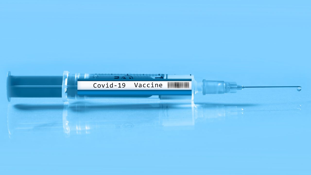
In the pharmaceutical and medical device industries, proper labeling is critical for ensuring patient safety, regulatory compliance, and effective use of products. Among the many elements of labeling, syringe label requirements are particularly strict, given the high precision required for administering injectable drugs.
One key aspect of syringe labeling is the font size and legibility of the information presented. This ensures that healthcare professionals and patients can accurately read and understand the instructions, dosage, and warnings printed on the label.
Importance of Legibility on Syringe Labels
Syringes are typically small, and the space available for labels is limited. Despite these constraints, the information printed on a syringe label must be clear, concise, and easily readable. Poor legibility can lead to errors in medication administration, including incorrect dosages or the use of the wrong drug. These mistakes can have serious or even life-threatening consequences. Therefore, ensuring that the font size and overall legibility of syringe labels meet industry standards is of utmost importance.
The font size on a syringe label is generally dictated by regulatory agencies, such as the U.S. Food and Drug Administration (FDA) or the European Medicines Agency (EMA). According to these agencies, the font size must be large enough to be easily readable under normal conditions without the aid of magnification. Typically, a minimum font size of 6-point is recommended, though larger fonts are encouraged when space allows.
For key information such as the drug name, dosage, and expiration date, the font size may be required to be larger than other details like the manufacturer’s address or batch number. The font size should strike a balance between fitting all necessary information on the label and ensuring that the text remains legible to healthcare professionals, who may need to read the label in a fast-paced or stressful environment.
Font Style and Contrast
In addition to font size, the style and contrast of the text are critical to ensuring legibility. Simple, sans-serif fonts like Arial or Helvetica are commonly used because they are easy to read, even at smaller sizes. These fonts provide a clean, uniform appearance that enhances clarity.
Contrast is another important factor. There must be a strong contrast between the text and the background to ensure that the information stands out. For example, black text on a white or light-colored background is ideal. Conversely, using low-contrast color combinations, such as light gray text on a white background, can reduce readability, especially in dim lighting conditions or for individuals with vision impairments.
Regulatory Guidance and Best Practices
Regulatory agencies offer detailed guidance on syringe label requirements, emphasizing the need for clear, readable, and unambiguous information. In the United States, for example, the FDA’s "Guidance for Industry: Labeling for Human Prescription Drug and Biological Products" outlines expectations for font size, style, and layout. These regulations aim to prevent medication errors by ensuring that healthcare providers can quickly identify key information on the syringe label.
Best practices include using bold or larger font sizes for critical details such as the drug name and dosage, avoiding overcrowding the label with unnecessary information, and using abbreviations only when absolutely necessary. Labels should also be tested under real-world conditions to ensure that they are legible in various environments, such as operating rooms or emergency departments where quick and accurate reading is essential.
Challenges and Solutions
One of the primary challenges in designing legible syringe labels is the limited space available on the syringe barrel. To address this, manufacturers often use wrap-around labels or multiple panels that unfold to display more information. Additionally, advances in printing technology have made it possible to print high-resolution text, allowing for smaller font sizes to remain legible.
Conclusion
The font size and legibility of syringe labels are vital components of safe medication administration. By adhering to regulatory standards and best practices in label design, manufacturers can ensure that their products meet the stringent syringe label requirements needed to protect patient safety and comply with industry regulations. Legible syringe labels help prevent medication errors and support healthcare professionals in delivering the correct treatment.